
Slanted Index Sections in Squarespace

Some time ago, I wrote an article outlining how to create slanted headers and footers as a way to add some fun visual interest to a website. That small bit of code was then featured within the Ghost Plugins library, and I’ve since been bombarded with emails containing questions about how to add slanted sections within a Brine Index.
As far as I know, there isn’t a way to slant the line between pages stacked together in an index. However, you can create the illusion of slanted section breaks very, very, easily.
I implemented this technique on a small website I did for a friend. See a live demo.
Here’s How It’s Done
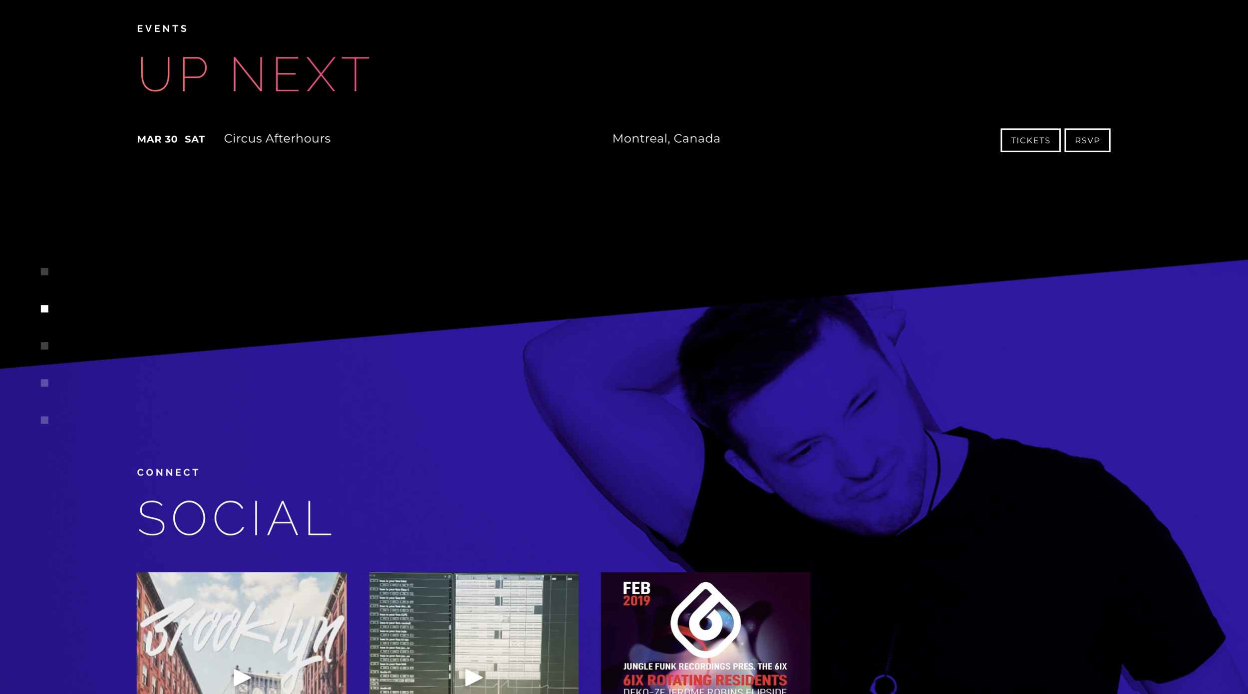
For this to work, you’ll need a section with a banner and a section with a solid background colour.
The code below creates an overlay over top of the banner with an angled gradient; the gradient goes from transparent to a solid colour that matches the colour of the page below. However, instead of a smooth gradient, we set the gradient so that it transitions from transparent to solid very abruptly, so it looks like a hard line.
Don’t worry if that doesn’t make sense. I probably didn’t explain that very well, but you might understand better when you see it and play around with the code a little.
Slanted Bottom Code
Place the following code in your custom CSS panel (Design > Custom CSS).
NOTE: The URL slug of the section that I wanted to add this slanted bottom to was named “/social,” that’s why I’ve written #social to target that section:
#social::before {content: '';width: 100%;height: 100%;background: linear-gradient(175deg, rgba(0,0,0,0) 85%,
#000 85.1%);position: absolute;top: 0;left: 0;z-index: 2;
}Explanation
The live demo and the example image above has a slant on the top and bottom of the section, which I will describe later. You don’t need to read the whole explanation if you’re not interested. You can just copy and paste the code and change the hex code (#000) to suit your site.
Here’s what’s happening in the code above to create a black, slanted pseudo-element at the bottom of the section with the banner.
content: creates the pseudo element with no content inside.
width: makes the element 100% of the width of the browser.
height: makes the element 100% of the height of the browser.
background: used to define the background colour or image of the section.
linear-gradient: usually used to display smooth transitions between two or more specified colors. The linear gradients
syntax is (direction, color-stop 1, color-stop 2, ... color-stop 3, 4, 5 if you want).
175deg: adjusts the pitch of the angle.
rgba(0,0,0,0): this is the color of the top part of the gradient, the last number of rgba defines the opacity. 0 = fully transparent. If we didn’t make this transparent, the entire element would be a large solid block that covered the whole banner.
85%: defines the position where the color ends.
#000: this is the hex code for black. Change this color to match the color of your index section.
85.1%: defines the position where the next color starts. Typically this number would be farther away from the first number to create a smooth gradient, but we don’t want a smooth gradient, we want a hard line.
position: positions the element relative to its parent element.
top: defines the top position of the element (stuck to the top of the section in this case).
left: defines the left position of the element (justified left in this case).
Slanted Top & Bottom Code
This is essentially the same as the code above, except it adds two more color-stops which creates a slanted color block at the top and a transition into transparency 12% of the way down. The bottom colour starts again at 85% of the way down.
#social::before {content: '';width: 100%;height: 100%;background: linear-gradient(175deg, #000 12%,
rgba(255, 255, 255, 0) 12.1%,
rgba(255, 255, 255, 0) 85%, #000 85.1%);position: absolute;top: 0;left: 0;z-index: 2;
}Slanted Top Code
You probably understand how this works by now.
#social::before {content: '';width: 100%;height: 100%;background: linear-gradient(175deg, #000 12%,
rgba(255, 255, 255, 0) 12.1%);position: absolute;top: 0;left: 0;z-index: 2;
}
I hope you find this helpful.
Until next time 👋🏽


![How to Change Images on Hover in Squarespace [Simple Guide]](https://images.squarespace-cdn.com/content/v1/671a6d15050267628d1bfe3a/1729955141069-JY8TZ37717WLM0T405BZ/Minimist+Web+Design+-+Squarespace+Designer+and+Developer+-+Change+Fluid+Engine+Images+on+Hover.png)


