Web Design Trends for 2019
2019 is upon us, and it’s time to work off all the turkey and holiday junk food you inhaled during the holidays and look forward to a new and exciting year of business.
In the web design business, like any tech-related business, technologies and trends move & change at an impossibly rapid rate.
You’ve probably noticed many of these trends emerging already. If not, you’re going to see them after reading this article. You’ve been warned: These insights cannot be unseen!
Flat Design
This one is my favourite, which is why it’s number one on my list.
Flat design has been taking the internet by storm (not quickly enough in my opinion). Some websites do it right, and others take it too far, many need a complete makeover; this is where I step in.
Flat design is at the complete opposite end of a scale on which skeuomorphic design is on the other end. Skeuomorphic design attempted to use nearly photo-realistic icons, imagery, textures and shadows to depict items on the screen. See, for example, Apple’s iPhone software iOS 6 vs. iOS 7 which adopted the first iteration of its flat design.
Flat design rejects the design principals of skeuomorphic design by entirely doing away with unnecessary decorative filigree and shifts the focus toward interface usability.
The central theme of flat design is simplicity and minimalism. Solid, vivid and complementary colours provide differentiation between static elements and elements that are meant to be interactive. The text is brief & to the point, likely accompanied by a simple, descriptive icon, and buttons are visible & distinctive.
In flat design, decorative elements are considered unnecessary clutter. That’s why I love it so much. Minimalism is my thing. Expect to see more of this in 2019.
Mobile Friendly Design
These days, more than half of all web traffic comes from mobile devices. Go outside and look around. 8/10 people are lost in the comforting glow of their phones.
On March 26, 2018, Google announced that they are rolling out their "Mobile-first" indexing of the web after years of experimentation and testing. According to their blog post, Mobile-first indexing means Google will use the mobile version of a web page “for indexing and ranking, to better help our – primarily mobile – users find what they’re looking for,” and by “primarily mobile,”
Google is referring to the fact that the majority of people who use Google search, do so from mobile devices.
With mobile sites taking priority, it’s no wonder that mobile first design has become a trend. But still, according to people familiar with the matter, 96% of consumers have encountered websites that were not optimized for mobile viewing, and 61% of users said that if they didn't find what they were looking for right away on a mobile site, they'd quickly move on to another website.
See this article to learn more about why you should have a mobile-friendly website.
Gradients
After the internet got over its crazy, tacky gradient hangover from the early 2000s, everyone moved over to skeuomorphic design, and now flat design is taking over the web. With that came the resurgence of gradients.
Gradients are making a comeback in a big way. You can find gradients ranging from subtle to extreme in all types of modern web and interface design, and it looks damn good when done right.
I recently wrote an article about How to Pick a Colour Palette for Your Website that includes a resource for creating your own gradients.
MASSIVE Titles, Headers & Text
There are more distractions than ever before, people get busier, and attention spans get shorter every day. Keeping people’s interest & attention has become a considerable challenge.
It’s for this reason that design is adapting to include giant, bold titles and shortened messaging to capture visitor attention fast, better known as brutalist design—a step away from the cutesy, friendly, colourful design that has been in vogue as of late.
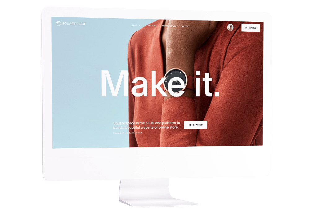
At the time of writing this article, Squarespace has recently undergone a corporate rebrand. At the same time, they’ve completely changed their overall design language. Their new website features text that is absolutely mammoth in size.
Squarespace employs award-winning designers provides beautiful pre-built website templates and is a leader in web design. There must be something to this giant title trend.
Entrance Animations
They just look cool.
Did you notice the entrance animations on this website? It adds just a hint of ‘je ne sais quoi.’
In addition to just looking cool, animations that trigger while scrolling contribute to the “Aesthetic Usability Effect” which states that users often perceive aesthetically pleasing design as design that’s more usable.
Aesthetically pleasing design can make users more tolerant of minor usability issues and not only showcases a visual design talent & front-end development skills, but it can increase your visitor’s time on page & engagement, which is an important SEO signal. Entrance animations can also encourage users to scroll or click through your pages.
As web browsers evolve, expect to see more of this type of visual interest element in 2019.’
Unusual Navigation
This is a trend that I am not a fan of, but one that I’m noticing more frequently.
”Unique” & Bizarre navigations drive me to the edge of sanity.
From my perspective, websites serve a very clear purpose. A website should showcase your passion, tell your story, be informative and work for you by automating repetitive or undesirable tasks like scheduling or order fulfillment.
Crazy website navigations conflict with Jakob’s Law which states that users spend most of their time on other sites. This means that users prefer your site to work the same way as all the other sites they already know. If users are looking for information and have to try to parse your website’s Rube Goldberg navigation, they will be moving on in a hurry.
—
As we look back at the end of 2019 and prepare for 2020 it's really incredible to see how many of these web design trends we predicted at the beginning of 2019 came true. You only have to look at any website to see how Mobile Friendly Design became absolutely key thanks to the new Google Mobile First Index and how Massive Titles, Headers & Text became a big trend.
But what about 2020? There are a number of web design trends we expect for 2020 including full page forms, Custom Illustrations, the continued rise of AI and Scaling Vector graphics, so why not check out my 2020 web design trends guest post to get a jump start on next year?


![How to Change Images on Hover in Squarespace [Simple Guide]](https://images.squarespace-cdn.com/content/v1/671a6d15050267628d1bfe3a/1729955141069-JY8TZ37717WLM0T405BZ/Minimist+Web+Design+-+Squarespace+Designer+and+Developer+-+Change+Fluid+Engine+Images+on+Hover.png)


